


Interpreting the inspiration given to you by a client can be one of the more challenging areas of design. You have to be part mindreader, part psychologist and part lion tamer. But it’s also the really fun and rewarding part where you start pulling pieces together and it all starts to make sense, look beautiful and fall into place.
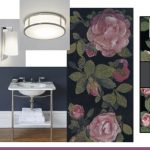
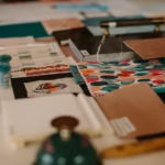
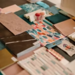
Recent clients of ours, owners of a 2 bedroom new build flat in Wimbledon, sent us the following images as inspiration and a guide to their style and product choices:
-

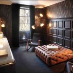
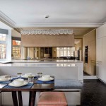
- Redesigning a Mayfair Townhouse
-

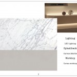
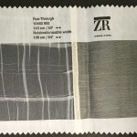
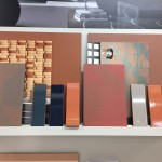
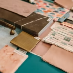
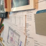
- The different finish process laid out was very impressive
-

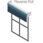
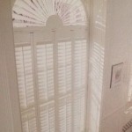
- Blind
-

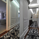
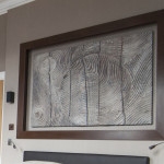
- Work In Progress of Painting the Panelling
-

- Source: Plum Care
-

- Source: Mac Sparky
-

- Source: Apple Insider
-

- Source: Cedia Flyer
-

- Source: Crestron
-

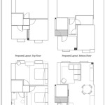
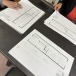
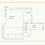
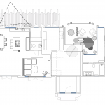
- Plans of Work They Had Completed
-

- Existing Layout
-
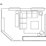
- Proposed Option 3
-

- Proposed Option 2
-

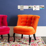
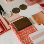
- Picking Colours
-

- From Tracy Walkers Smith on Tumblr
-

- Romo Tulipa Collection
-

- Sneak peak of the designs
-

- Files Uploaded in to Basecamp for everyone to review and comment
-

- A selection of pelmet designs at Premier Choice
-

- A waterfall hang
-

- Utility features
-

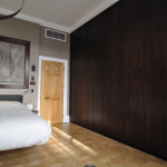
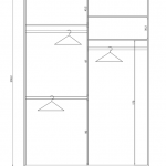
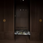
- New walk-through wardrobes
-

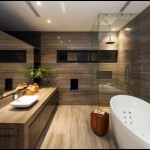
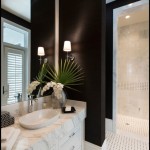
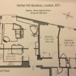
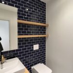
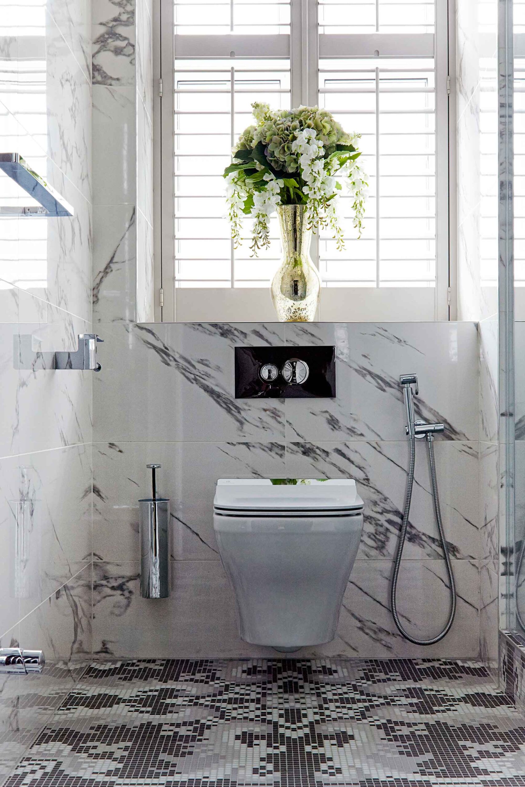
- New bathroom layout
-

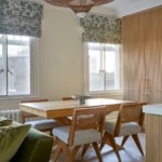
- Layout 2
-

- A selection of Sylka carpet samples
-

- Master Bedroom Scheme
-

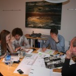
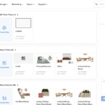
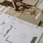
- Scheme research tools
-

- Artist impression of the Art Centre
-

- The Art Centre’s main and final construction package is expected to be complete in April 2017
-

- Wallpaper available from Cole and Sons
-

- A similar wallpaper from Albany
-

- Inspirational Pinterest
-
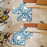
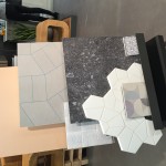
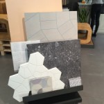
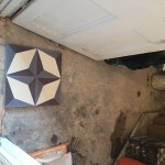
- Picking Tiles Patterns
-
- Star at the front
-
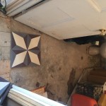
- Burst at the front
-
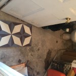
- Star further in…the winner!
-

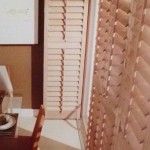
- Full Length Shutters
-

- Solid Shutters
-

- Tier-on-Tier
-
- Tracked Shutters
-

- A 75% increase in visits from social media within 1 week (coschedule started on 12th July)
-
- Proposed Ground Floor Layout
-

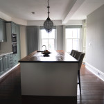
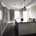
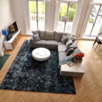
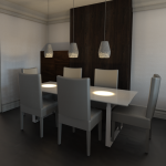
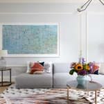
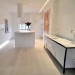
- Open Plan Knightsbridge Apartment
-
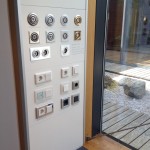
- Settings
-

- [epicslider_caption caption_type=”impact” caption_position=”bottom-left” caption_width=”600″] [span class=”size-5″]”Kia came up with a design that exceeded our expectations” – Duncan [/span] [button url=”https://www.kiadesigns.co.uk/tell-us-about-your-project/” color=”dark-gray”]Book Your Appointment Today[/button] [/epicslider_caption]
-
- [epicslider_caption caption_type=”impact” caption_position=”top-left” caption_width=”600″] [span class=”size-5″]”All in all, it has been an absolute pleasure working with both Kia and her team” – Amrita[/span] [button url=”https://www.kiadesigns.co.uk/tell-us-about-your-project/” color=”dark-gray”]Call Us Today[/button] [/epicslider_caption]
-

- [epicslider_caption caption_type=”impact” caption_position=”bottom-right” caption_width=”600″] [span class=”size-5″]”She managed to incorporate design elements we felt we couldn’t live without” – Jacquie[/span] [button url=”https://www.kiadesigns.co.uk/tell-us-about-your-project/” color=”dark-gray”]Book Your Appointment Today[/button] [/epicslider_caption]
-

- [epicslider_caption caption_type=”impact” caption_position=”top-left” caption_width=”600″] [span class=”size-5″]”We were so pleased to have a place to call our peaceful home in the midst of chaotic London” – Tony[/span] [button url=”https://www.kiadesigns.co.uk/tell-us-about-your-project/” color=”dark-gray”]Start Your Home Now[/button] [/epicslider_caption]
-

- [epicslider_caption caption_type=”impact” caption_position=”top-left” caption_width=”600″] [span class=”size-5″]”There were so many decisions to make and I wouldn’t have been able to make them without her input” – Shola[/span] [button url=”https://www.kiadesigns.co.uk/tell-us-about-your-project/” color=”dark-gray”]Book Your Appointment Today[/button] [/epicslider_caption]
-

- [epicslider_caption caption_type=”impact” caption_position=”bottom-left” caption_width=”600″] [span class=”size-5″]”Kia managed to weave together traditional and modern vibes with aplomb” – Jacquie[/span] [button url=”https://www.kiadesigns.co.uk/tell-us-about-your-project/” color=”dark-gray”]Book Your Appointment Today[/button] [/epicslider_caption]
-

- [epicslider_caption caption_type=”impact” caption_position=”top-left” caption_width=”600″] [span class=”size-5″]”Kia was instrumental in helping us create a home that we love. ” – Shola[/span] [button url=”https://www.kiadesigns.co.uk/tell-us-about-your-project/” color=”dark-gray”]Start Working With Us Now[/button] [/epicslider_caption]
-

- [epicslider_caption caption_type=”impact” caption_position=”bottom-left” caption_width=”600″] [span class=”size-5″]”She is extremely knowledgeable and gracious, and did a great job of educating us on what to expect” – Thomas[/span] [button url=”https://www.kiadesigns.co.uk/tell-us-about-your-project/” color=”dark-gray”]Book Your Appointment Today[/button] [/epicslider_caption]
-

- [epicslider_caption caption_type=”impact” caption_position=”bottom-right” caption_width=”600″] [span class=”size-5″]From start to finish we provide you with a luxury service[/span] [button url=”https://www.kiadesigns.co.uk/tell-us-about-your-project/” color=”dark-gray”]Book Your Appointment Today[/button] [/epicslider_caption]
-

- [epicslider_caption caption_type=”impact” caption_position=”bottom-right” caption_width=”600″] [span class=”size-5″]”Kia brings creativity, energy and attention to detail to every project as well great ideas and attitude” – David[/span] [button url=”https://www.kiadesigns.co.uk/tell-us-about-your-project/” color=”dark-gray”]Book Your Appointment Today[/button] [/epicslider_caption]
-

- [epicslider_caption caption_type=”impact” caption_position=”top-left” caption_width=”600″] [span class=”size-5″]”Kia renovated our split-level flat in West-London with great professionalism and taste. She would always go the extra mile to exceed our expectations” – Laurence [/span] [button url=”https://www.kiadesigns.co.uk/tell-us-about-your-project/” color=”dark-gray”]Talk To Us Today[/button] [/epicslider_caption]
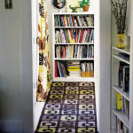
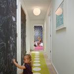
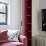
The brief was to make the flat feel more like home, make it an interesting space for guests and provide more storage (that old chestnut). Their flat had an overly generous hallway which was a terrible waste of space. Rather than placing a large bank of wardrobes along it, which would have more than solved any storage issues but been an eyesore, we decided to make it a welcoming entranceway with selected storage for key pieces.
New build flats tend to lack character, so it’s important to gain a sense of it history and personality. We initially added art work related to their travels and contemporary pieces with a vintage feel in amongst the slicker, newer pieces they already owned to stop it looking like a show home.
Inspired by the Dulux Paint of the Year presentation we attended, we decided to go with creative use of paint, rather than wallpaper, allowing us to zone off smaller areas more effectively, and making it an easily changeable, durable, budget friendly way to introduce lots of colour (which the clients aren’t scare of, but the flat was lacking).
The clients liked it overall, but as their tastes were strictly modern, had a hard time imagining themselves owning several of the pieces. We hear ‘I would never have chosen that’ quite a lot (which is why you have hired us, no? If we only bought what you bought you could do it yourself). We toned down a few of the pieces and introduced some industrial flare to keep the design interesting but less ‘vintage’.